ShopDreamUp AI ArtDreamUp
Deviation Actions


Description
Gumroad | Tumblr | Soundcloud | Facebook
This is an Animation Comission for:
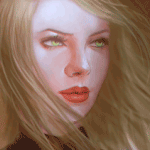
Original Painting::origin()/pre11/064b/th/pre/f/2016/319/a/a/aleena_by_z_a_i_n_a-daohdgw.png)
I am making a huge discount for animation comission 300$ to 125$, this animation is the first one I was noted! There is one slot left! Send me a note!
The music is not mine: www.youtube.com/watch?v=nmUqrf…
This is an Animation Comission for:
Original Painting:
I am making a huge discount for animation comission 300$ to 125$, this animation is the first one I was noted! There is one slot left! Send me a note!
The music is not mine: www.youtube.com/watch?v=nmUqrf…
Image size
659x1080px 3.85 MB
© 2017 - 2024 MichelVictor
Comments60
Join the community to add your comment. Already a deviant? Log In
It's been a long time since I made a critique!
The first thing that caught my eye was the animation on the chest to indicate breathing. I can see you enlarged the breasts and stuck the shoulders out but it really seems to just look like you are growing and shrinking them. I suggest maybe watching videos or friends to study the chest expanding when someone breathes? The choice of growing the breasts maybe 40% larger is just a strange choice!
The other two reviews did mention the head nod. As far as my understanding goes you made a painting and edited everything on a single layer? I can see how that would be very limiting, but it doesn't have much of a sense of depth or movement, again just placement of the face shifting.
I think the biggest thing to work on would just be fluid, 3d movement if you can find a way to do that with your current methods. Things just seem to grow and shrink and not "move" (aside from the hair.) And maybe add some more movement to the body since the other movements are so full? Like that heavy wind that is blowing her hair so hard might tilt her body slightly, adjust her arms, etc.
That being said I like the subtle details you gave such as the electricity moving through her suit. It adds something interesting and yummy to look at! The glare of light is very nice too. You have a good sense of color and where to focus certain focal points in the piece.
As far as the painting goes, I think this piece would benefit from some more detailed negative space. Her body seems a bit stiff and straight on, and like you did within the hand and arm on the left, I think adding some more interesting shapes and perspective would draw in a lot more interest. A straight figure can sometimes create a "okay cool" reaction rather than curious eyes and a lot of viewer interaction and exploration.
As a random point; I love your skill with eye movement. It looks so rich and real. Her eyes dart very realistically.